Kids are visual people. In schools, colors play a big role in learning, from coloring books to art classes, and more. Times have changed drastically in the last few decades; schools were once dull and drab combinations of uniforms and hallways. That’s a far cry from what we have today.
It’s been shown that in addition to teachers, the school building, learning materials, and other factors that help kids learn, the appropriate use of colors is invaluable.
How colors affect school children
Children aged 3 to 6 are drawn to warm, bright colors such as light red or yellow. These colors match their high energy levels.
Kids in elementary school are often more than just a little distracted. They’re better off looking at colors that help them concentrate. Such colors include green, purple, and blue, as well as other shades or combinations of them.
As for those in high school, they are much older and likely to have hit puberty. Perhaps, they’re passing through that notorious, rebellious phase and might need to be as unique as possible. Regardless, their taste is often a bit more refined and tilted toward cooler colors. Little wonder blues, greens, and beige are popular in high schools.
How to use colors in schools
We’ve outlined general color schemes to use according to age brackets. This doesn’t imply one color should be used around the entire school simply because it’s good for children in a particular age bracket.
Let’s see the proper colors to use in schools according to location –
- Classrooms
The heart of the school. Blue or lighter shades of blue is a great choice. White can also be used as a background color as long as colorful accents are added to it.
- Cafeterias
This is probably the students’ favorite part of the school. Orange not only looks great here but also enhances appetite. A few drawings of green fruits and such will fit in nicely.
- Offices
Now, things are getting serious. Colors that speak to authority such as cool neutral greys are perfect for these areas. However, adding violet creates a relaxing atmosphere in such areas. Administrators can have fun, too!
- Libraries
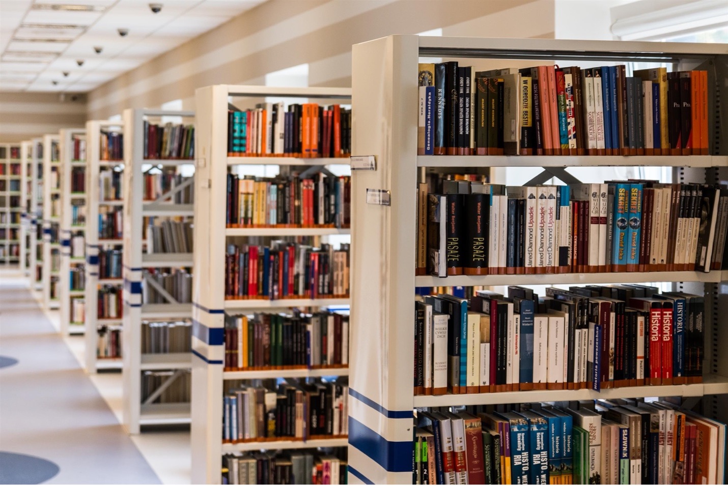
Lower wavelength colors such as green promote concentration and improve focus. A school library would benefit from being painted with this color so students can focus on their studies. [1]
- Gyms
A place of high activity, gyms ought to be painted colors that promote and increase activity levels. Colors such as red or a sharp pink are stimulating and exciting. These are perfect for gyms.
- Corridors and hallways
Colors that indicate passage or give a sense of movement go nicely here. Shades of purple, green, and yellow are great options. [2]
Pro tip:
Accent walls and other visual focal points such as quotes or special scenes evoke appropriate emotions in schools.
Ultimately, schools are a great place to try out different colors and arts. Education encompasses way beyond textbooks and such. For an all-round experience, other aspects of the school including the architecture should be given appropriate consideration.
